Fight for the Future: More education, less cutesy graphics.
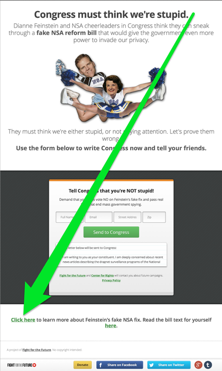
25 Nov 2013Found myself very frustrated with Fight for the Future today. Why bury the link to the text of the bill and the article explaining why it's not a real reform bill at the VERY bottom of the page? And why not include a link in the mass-email they sent out. The email had 11 other links (I counted), yet not the most important one - the education.
These initiatives should be about education, not simply blindly doing whatever Fight for the Future, EFF, or any other organization asks us to. If we're just blindly following the hottest most popular organization of the day then we truly and sadly are running blind. Open your eyes, understand, then act.
I took a quick stab myself at redesigning the landing page to focus more on the education and less on the graphics.
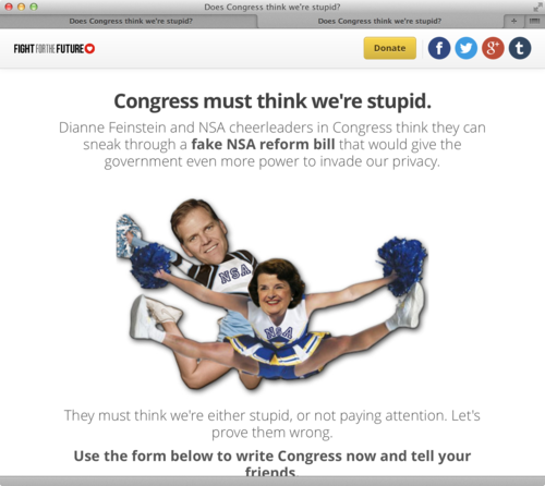
The site as it was when I saw it:

I feel this would be a huge improvement:

Maybe the red call to action is too much, but you get the point. The education is right there at the top for anyone who wants to learn more and taking action is still just as easy as it was before.
And where was the education link on the original?

Also, what's up with the tiny 80px high text box showing the letter you're about the send to congress? The page is already over 1600px tall - lets devote a little more space to the all important letter to congress so a visitor can easily read and edit the letter if that is their intention.
Here is a direct link to the page in question.